
The Dress Illusion
The photo that split the internet, and the color science behind it.
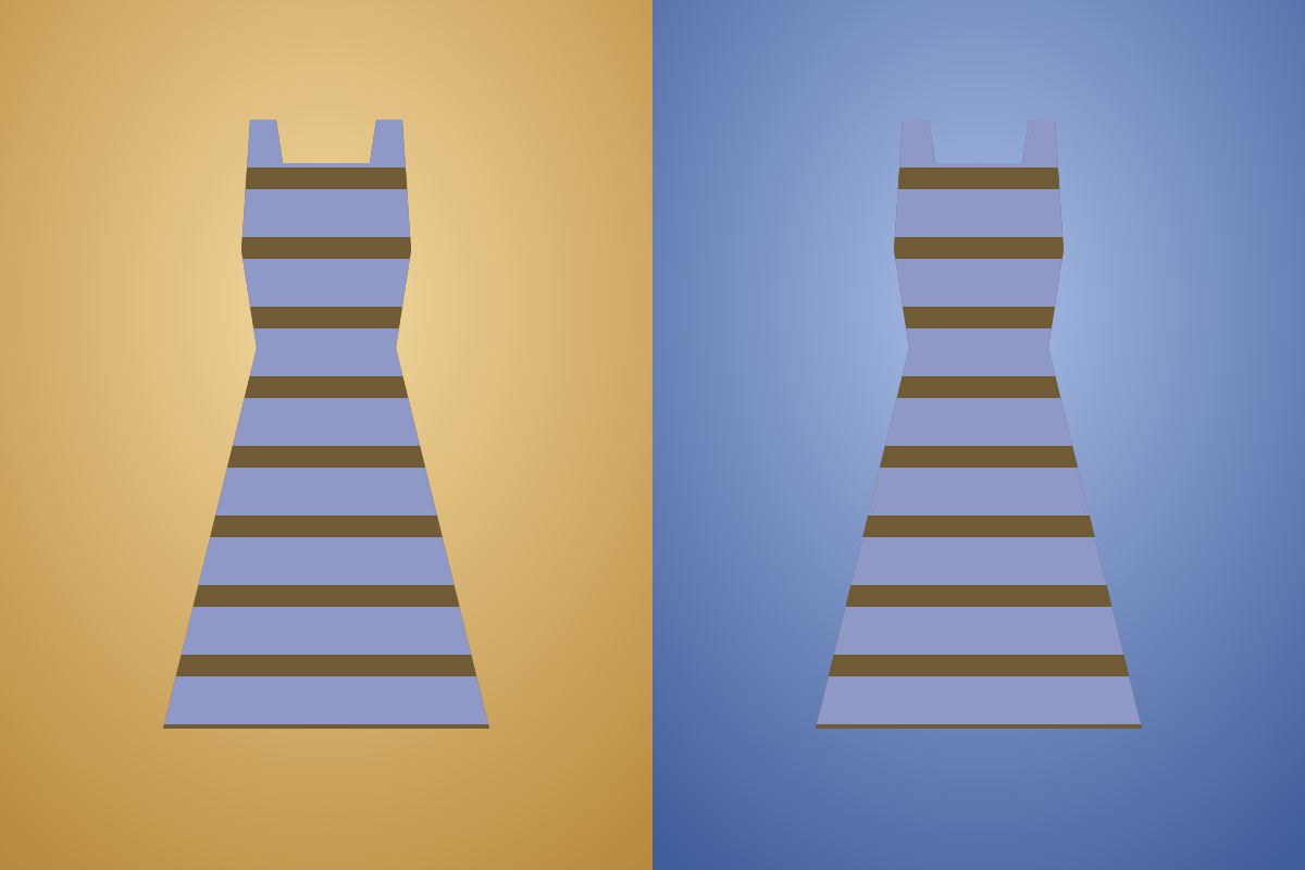
What do you see?
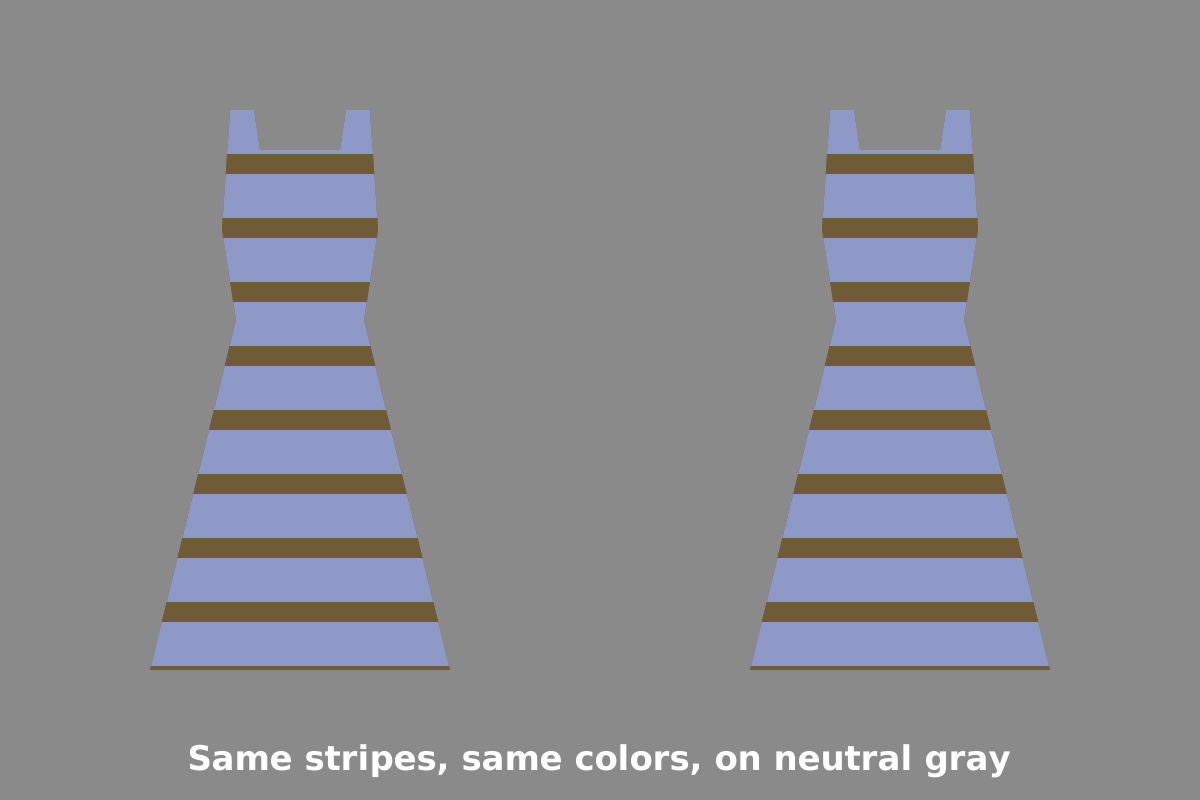
Two striped dresses, one on a warm golden background and one on a cool blue background. They are identical: every stripe uses exactly the same two colors in both halves. Yet many people see the dress on the blue background as lighter and more white-and-gold, and the dress on the gold background as darker and more blue-and-black. Press the reveal button to put both dresses on the same neutral gray.
How it works
In February 2015 a washed-out phone photo of a striped dress went viral. Some people insisted it was blue and black, others were just as sure it was white and gold, and a few saw it switch. The real dress was blue with black lace. The disagreement was a vivid example of color constancy, the brain's habit of discounting the color of the light so that objects keep a stable color.
Every color that reaches your eye is a mix of the object's surface color and the color of the light falling on it. A white shirt in blue evening shade sends bluish light to your eye, and the same shirt in warm indoor light sends yellowish light. Your visual system tries to work out the lighting and subtract it. Usually this works so well that you never notice it.
The dress photo was ambiguous about the lighting. It was overexposed, tightly cropped and lacked clear clues about the surroundings. If your brain decided the dress was in bluish shade, it subtracted blue, and the pale blue stripes became white while the dark stripes became gold. If your brain decided it was lit by warm artificial light, it subtracted yellow, and the stripes looked blue and black.
Why did people choose differently? Studies published in 2015 in the journal Current Biology, including work by Rosa Lafer-Sousa, Katherine Hermann and Bevil Conway, found that age and other factors were linked to which version people saw. Later work by Pascal Wallisch suggested that people's assumptions about lighting matter: people who said they assumed the dress was in shadow were more likely to see white and gold. Researchers also pointed out that the dress colors lie along the natural range of daylight, from blue sky to golden sun, which makes the lighting especially hard to judge.
Our demo uses the same idea in a simpler way. The warm and cool backgrounds suggest different lighting, and your visual system adjusts the stripes to match. Because our picture gives stronger context than the original photo, most people see the effect in the same direction, but it shows the principle that split the internet.
History
The photo was taken by Cecilia Bleasdale in a shop in early 2015 and shared online that February, where it was viewed and argued about by millions of people within days. Vision scientists quickly published studies, and it became one of the best-known examples of individual differences in color perception. The original photograph is not reproduced here; the demo above is an original illustration made for Opticalillusions.com.
Try it
- Cover one half of the picture and compare the dress with your memory of the other one.
- Press reveal and see how similar the two dresses look on neutral gray.
- Look at a white sheet of paper in daylight and under a warm lamp. It looks white both times, which is color constancy at work.
- Ask friends what color they remember the famous dress being, and why.
Frequently asked questions
What color was the dress really?
The real dress was blue with black lace.
Why did people see the dress differently?
Your brain tries to subtract the color of the light. If it guessed bluish shade, the dress looked white and gold. If it guessed warm indoor light, it looked blue and black.
Are the two dresses on this page the same colors?
Yes. Every stripe uses exactly the same two colors in both halves. Press the reveal button to put both on the same gray.
Who took the photo of the dress?
Cecilia Bleasdale took it in a shop in early 2015, and it went viral that February. The original photo is not shown here; the demo is an original illustration made for Opticalillusions.com.
Sources & credits
The original photograph was taken by Cecilia Bleasdale (2015) and is not reproduced here; our two-dress demo is an original illustration.
- Lafer-Sousa, R., Hermann, K. L. & Conway, B. R. (2015). Striking individual differences in color perception uncovered by 'the dress' photograph. Current Biology, 25.
- Brainard, D. H. & Hurlbert, A. C. (2015). Color vision: understanding #TheDress. Current Biology, 25.
- Wallisch, P. (2017). Illumination assumptions account for individual differences in the perceptual interpretation of a profoundly ambiguous stimulus in the color domain: 'The dress'. Journal of Vision, 17.
- The dress — overview Read →
Further reading: The Illusions Index (University of Glasgow) and Michael Bach’s Optical Illusions & Visual Phenomena.
Written by K.R. for Opticalillusions.com · Updated . Illusion artwork © The Wizard Of Sales, LLC. Feel free to share a link; see our terms for reuse.
Related illusions
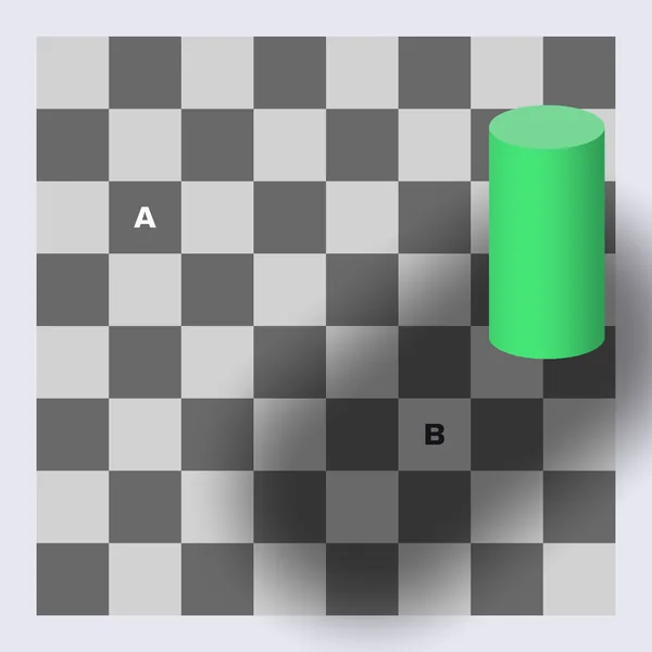 InteractiveBrightness illusionsCheckerboard Shadow IllusionA dark square in light and a light square in shadow are the same gray.
 InteractiveBrightness illusionsSimultaneous ContrastA uniform gray bar looks lighter on the left and darker on the right.
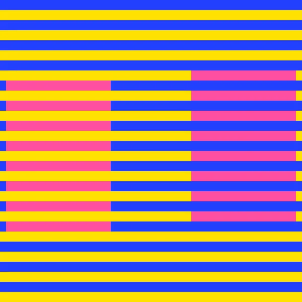 Color illusionsMunker-White IllusionThe same pink looks like two colors on blue and yellow stripes.
 InteractiveColor illusionsAfterimage FlagStare at a cyan, black and yellow flag and a red, white and blue one appears.