
Why Colors Trick Your Eyes: The Science of Color Illusions
The color you see is not simply the color that is there. Your brain builds it from comparisons, guesses about the lighting and a little fatigue, and color illusions catch it in the act.
Color is made in your brain
Light has wavelengths, but it does not have color. Color is what your visual system makes of that light, and it makes it by comparing. Every patch you see is judged against its neighbors, against what came just before and against your brain's best guess about the light falling on the scene. Most of the time this gives you stable, useful colors: a banana looks yellow at noon and at sunset. A color illusion is a picture designed so that the comparison gives a surprising answer.
To see why, it helps to know how the system is built.
How your eyes build color
The retina has three types of cone cells, each most sensitive to a different range of wavelengths: long, medium and short, often called red, green and blue cones. This three-channel idea goes back to Thomas Young and Hermann von Helmholtz in the nineteenth century, and it is why screens can show millions of colors using only red, green and blue pixels.
The cone signals are then recombined. In the 1870s the German physiologist Ewald Hering noticed that we never see a reddish green or a yellowish blue, and proposed that color is coded in opposing pairs: red against green, blue against yellow and light against dark. Later research found nerve cells that behave very much like these opponent channels. Both ideas turned out to be right: three cone types at the start, opponent pairs further along.
Two features of this design explain almost every color illusion. First, the system cares about differences more than absolute values. Second, its cells adapt: keep showing them the same color and they turn down their response.
Color constancy: correcting for the light
A white sheet of paper reflects bluish light in the shade and yellowish light under a lamp, yet it looks white in both places. This is color constancy. Your brain estimates the color of the light and discounts it, so that objects keep a stable color as the lighting changes. In the 1970s the inventor and scientist Edwin Land demonstrated how strongly this works with displays of colored patches lit by different mixtures of light.
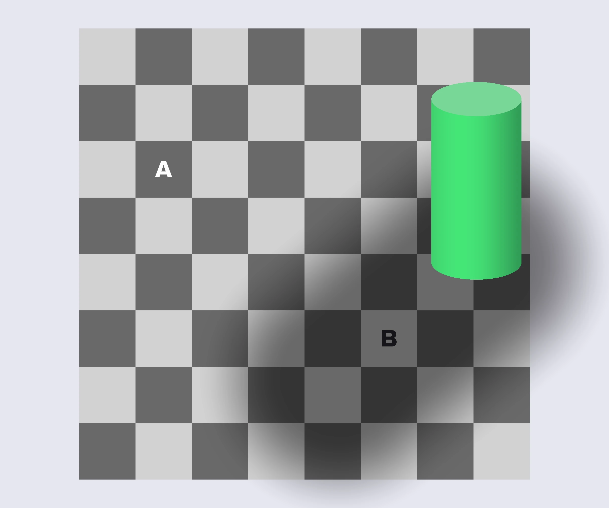
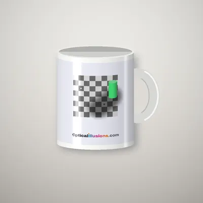
The Checkerboard Shadow Illusion shows the same correction for lightness. Square B sits in a shadow, so your brain brightens it, and it ends up looking much lighter than square A, even though both are the same gray. Constancy is a feature, not a bug, but it means the color you see is partly a guess about the lighting. When the lighting is unclear, different people can guess differently, which is exactly what happened with the dress. Our Dress Illusion page shows the effect with two identical striped dresses on warm and cool backgrounds.
Simultaneous contrast: colors push each other apart
Put a gray square on a red background and it takes on a faint green tint. Put the same gray on green and it looks slightly pink. This is simultaneous contrast: a color tends to look shifted away from the color around it, toward its opposite.
The French chemist Michel Eugène Chevreul described the rules of simultaneous contrast in 1839. He had been asked why some dyed yarns at the Gobelins tapestry works looked dull, and found that the dyes were fine: the problem was the colors woven next to them. His findings influenced painters for generations, and the artist Josef Albers built a famous course on them, published in 1963 as Interaction of Color.
The brightness version is easy to see in our Simultaneous Contrast demo, where a single gray bar seems to fade from light to dark across a gradient. Contrast like this sharpens edges and makes objects stand out from their background, which is useful in a world full of shadows and haze.
The Munker illusion: when colors blend instead
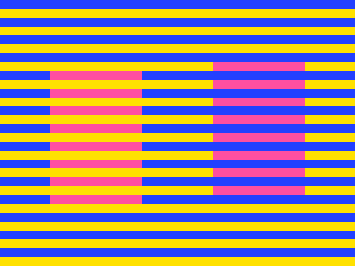
Sometimes the opposite happens. In the Munker-White Illusion, identical pink bars are laid across blue and yellow stripes. The bars woven into the blue stripes look cooler and more purple, while the bars woven into the yellow stripes look warmer and more orange. Instead of moving away from their neighbors, the colors seem to move toward the stripes they belong to. This is called assimilation.

Hans Munker reported the color effect in 1970, and Michael White described a black-and-white version in 1979. Why assimilation wins here is still debated. One explanation is that thin stripes get partly blended by the eye's limited sharpness. Another is that the brain groups each bar with the stripe it seems to belong to and judges its color as part of that stripe. The truth may involve both. Our Kwanzaa Kinara Color Illusion uses the same effect to make six identical candles look red or green.
A related trick is the Watercolor Illusion, described by Baingio Pinna in 1987. A thin colored line running inside a darker outline makes a whole white region look faintly tinted, as if the color has bled across the paper.
Afterimages: the colors that are not there
Stare at a bright red shape for 30 seconds, then look at a white wall, and a blue-green ghost appears. This is a negative afterimage. The cells and channels that were signaling red have adapted and turned down their response, so when you look at white, the balance tips toward the opposite color. Each color leaves its opponent: red leaves cyan, yellow leaves blue and black leaves white.
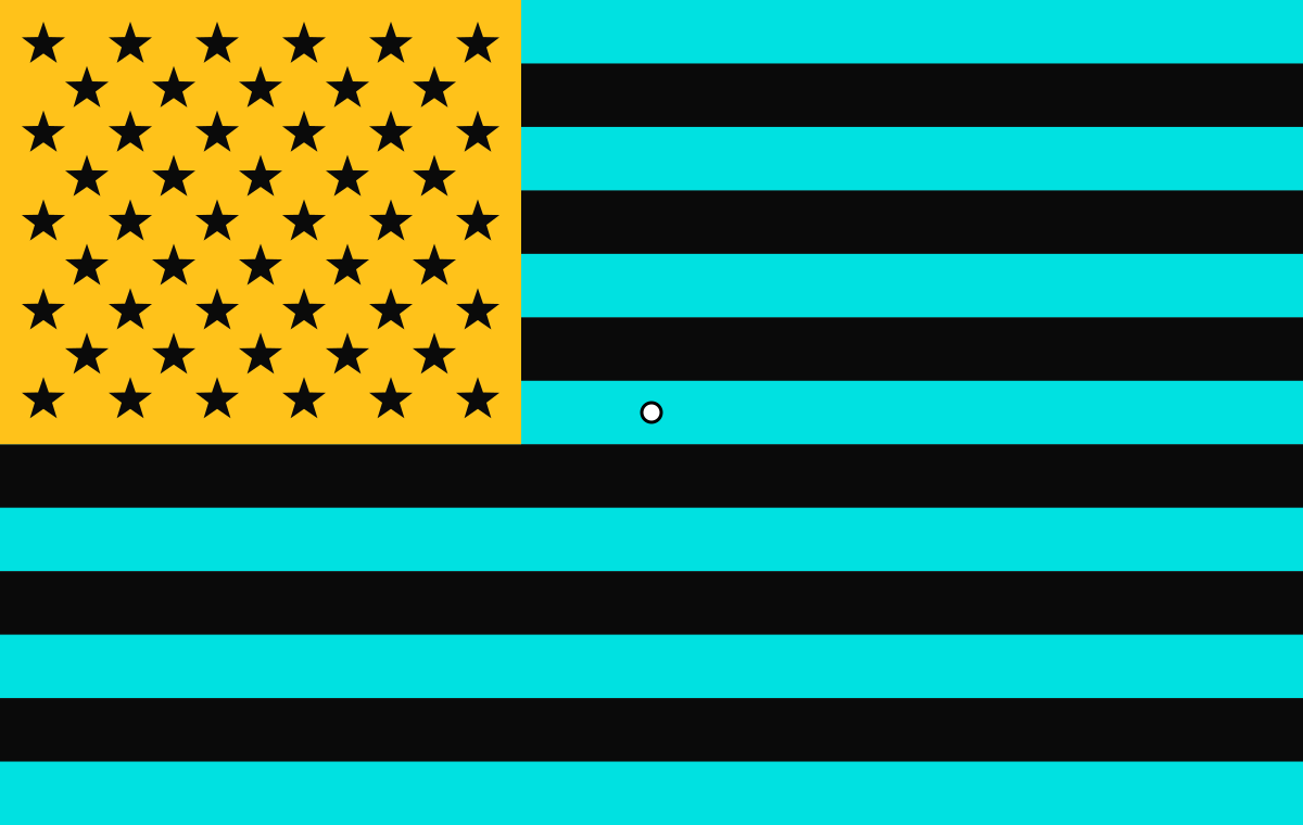
Our Afterimage Flag uses this rule in reverse: the flag is printed in the opposite colors, so the afterimage shows the familiar red, white and blue. The writer Johann Wolfgang von Goethe described colored afterimages in his 1810 Theory of Colors, and Hering later used them as evidence for opponent channels.
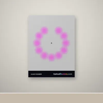
The Lilac Chaser, created by Jeremy Hinton around 2005, combines afterimages with fading. As each lilac disc disappears in turn, the gap leaves a green afterimage that seems to race around the ring. Keep your eyes still and the lilac discs fade from view altogether, an effect called Troxler fading.
Why color illusions matter
Color illusions are not just curiosities. Painters and designers use simultaneous contrast to make colors glow or recede. Paint and fabric samples can look different at home than in the store because both the lighting and the surrounding colors have changed. Scientists use carefully measured color illusions to test models of how the visual system works. For anyone choosing paint, clothes or a logo, the lesson is simple: judge a color in the place and light where it will be seen, next to the colors it will sit beside.
Try it yourself
You can see every effect in this article for yourself. Start with the illusions below, use the reveal buttons to check the real colors, and browse all of our color illusions. For a guide to every family of illusion, read types of optical illusions, explained.
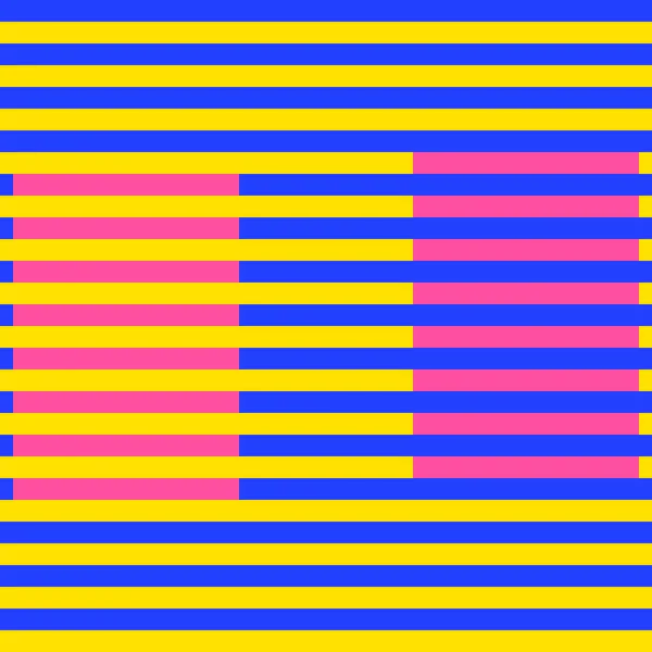 Color illusionsMunker-White IllusionThe same pink looks like two colors on blue and yellow stripes.
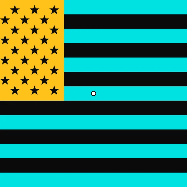 InteractiveColor illusionsAfterimage FlagStare at a cyan, black and yellow flag and a red, white and blue one appears.
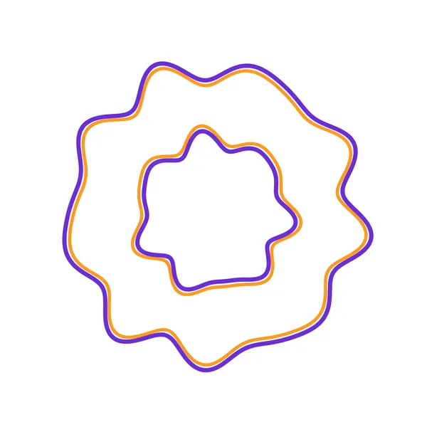 Color illusionsWatercolor IllusionA thin orange edge tints a whole white region pale orange.
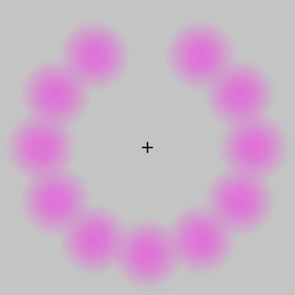 InteractiveColor illusionsLilac ChaserA ring of lilac blurs where a green dot seems to race around, and then the lilac vanishes.
Questions and answers
Why do two identical colors look different?
Your brain judges every color relative to its surroundings and to its guess about the lighting. Change the neighbors or the apparent lighting and the same color can look lighter, darker or a different hue.
What is color constancy?
Color constancy is the brain's habit of discounting the color of the light, so that objects keep a stable color in shade, sunlight or lamplight. It works well most of the time, but it is also what makes the checkerboard shadow illusion and the dress possible.
Why do I see the opposite color after staring?
Staring makes the cells and color channels that respond to that color adapt and weaken. When you then look at white, the opposing channel wins for a few seconds, so you see the complementary color.
Are color illusions the same for everyone?
The basic effects work for almost everyone with typical color vision, though their strength varies. A few images, like the dress, split people into groups because they depend on assumptions about lighting.
Enjoyed this? Get a new illusion every week
One original illusion in your inbox each week, with the science explained in a minute.
Written by the Opticalillusions.com team · Published . Illusion artwork © The Wizard Of Sales, LLC. Spotted an error? Tell us.
More from Learn
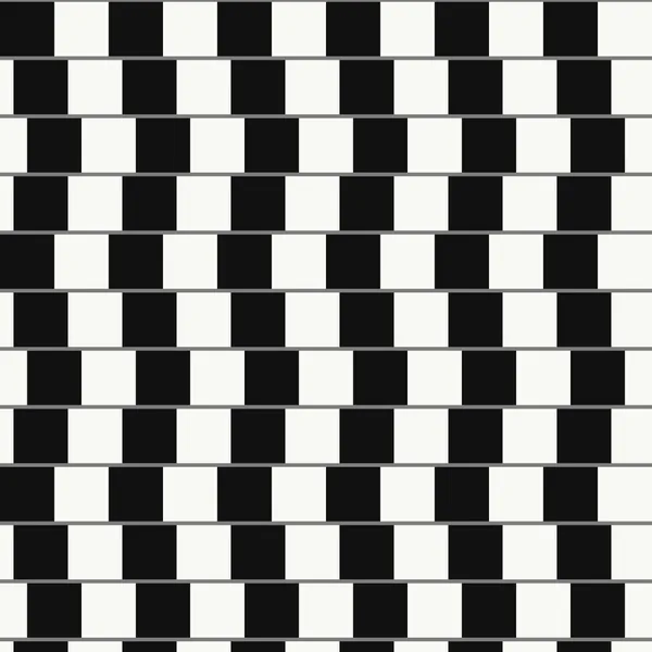 Learn · GuideTypes of Optical Illusions, Explained (With Examples)Literal, physiological and cognitive illusions, plus motion, color, geometric, ambiguous, impossible and afterimage illusions, with an example of each.
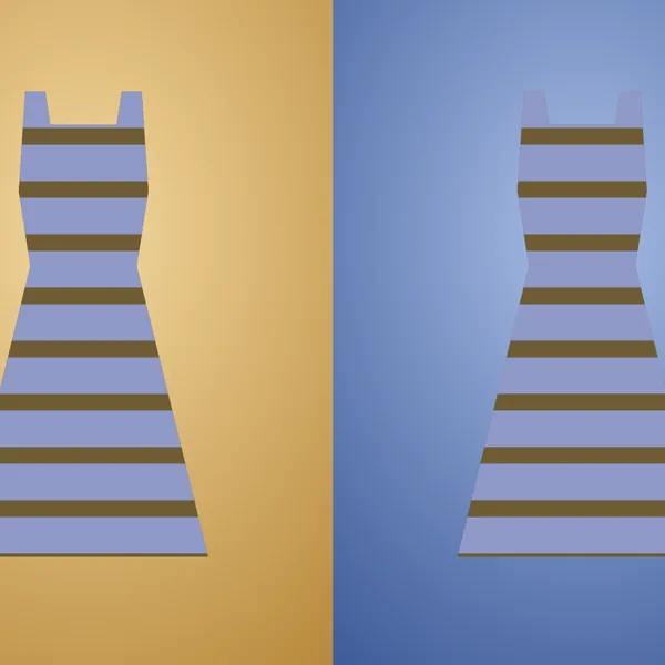 Learn · GuideThe Dress: Why Everyone Saw It DifferentlyBlue and black or white and gold? The 2015 photo, the lighting assumptions behind it and what scientists found when they studied it.